As mentioned in the previous article of this two-part series, I suffer from astigmatism, in a mild form that is mostly corrected by my eyeglasses. While the first part discussed the “star” effect, this part will focus on the most common symptom, the blurriness.
If you go over to the Wikipedia page for Astigmatism, you will see the following image:
It clearly describes what I observe on a daily basis, which is that everything is a bit blurry. When I was younger, I was capable of not using my eye glasses and corrected the issue by squinting a lot while reading. This was tiresome and no longer works as my eyeballs are getting stiffer with age. As a result, my brain is trained at finding blurriness and trying to remove it from the picture. It’s a bit like what an upscaling video processor is trying to do when receiving a SD stream to be displayed on a HD, 4K or 8K display.
When I started working with computers 30 years ago, I received a monochrome display, with its nice orange characters on a black background. I won’t lecture you on the underlying technology but what needs to be reminded is that the “dots” on the monitor were appearing because a phosphorous layer was hit by an electron beam. Getting this beam to be thin and having it hit only a given tiny square on the emitting layer was a challenge. This means that on those monitors, there always was a bit of blur around where the beam hit the front of the monitor.
As years passed, the technology evolved from CGA to EGA then VGA and upper resolutions, always increasing the number of pixels on screen and their possible colors. But the display technology never changed, it always was an electron beam hitting phosphorus, and so pretty much everything was still blurry on the edges. While it was nice for video games or movies because it provided small scale anti-aliasing for free, it was a different story when it came to still images, especially text. Remember, my brain is trained at finding blurriness, smudges, and tries very hard removing them because it thinks it comes from the eye ball, not the world around it. After hours of using a computer monitor, my brain would start giving up and erroneously conclude that there was some dust in front of the eyeball. And to fix that, it would then trigger the lacrimal glands to clean up the mess!
And then, in the early 2000’s, the LCD monitor started to be both affordable and of good quality. They did not provide as high resolutions as the CRTs, but they had one distinct advantage for me: there was no electron beam, meaning pixels would not “spill” on each other!
For games and movies, this had the disadvantage that every pixel was clearly visible and so video cards has to implement more powerful and efficient antialiasing methods. But for text reading, program development and pretty much any static image, this meant that the blurriness was gone! Sure, there is a bit of jagged edges on large characters, but what a relief for my eyes!
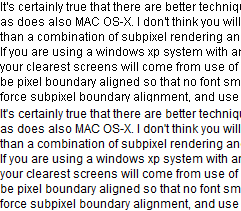
And while the technology has not changed that much up until now, the software evolved, especially when it comes to operating system. With the introduction of Windows XP, someone thought that the blurriness was missing, or that maybe antialiasing was a good thing for text and so ClearType was introduced. And with it, the blurriness was back! To illustrate, here is a picture taken from the Wikipedia page about ClearType:

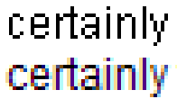
The top part is rendered without any antialiasing, while the bottom part is rendered with ClearType. It might not be obvious to a “perfect vision” reader, but the top is sharp and perfect while the bottom looks clearly blurry to me. And when we zoom in, you get this:

Why does ClearType need to add a vertical blue line along the lower case L letter? It only adds extra information for my brain to process, when it’s already chasing any blurriness to overcome the issue with my cornea. And look at the “y” letter, it’s so degraded that it looks almost transparent!
Fortunately for me, it was possible to completely disable it, which is what I did as the first step after installation. Not doing any antialiasing has one drawback when large fonts are used. They do have a jagged effect which is clearly visible. But because most of what I read is text in the 8 to 12 points range, I rarely see the issue.
When I upgraded to Windows 7, I sadly discovered that ClearType could no longer be entirely removed and so the blurriness was everywhere. Scouting on various websites, I finally found a great registry tweak where you trick Windows into thinking that the Segoe UI font is missing, forcing it to use MS Sans Serif instead. And with that, I was back in business, except for the applications that do not respect my choice! Most notably are all the .Net WPF based applications but also some common controls that thus look weird inside otherwise perfectly clear. One example is the TortoiseSVN commit dialog:

And in that case, it’s even worse, if you look closely at the two capital P letters:

The added blurriness is not even coherent which gives another false signal to my brain, leading to even more work to get back to a clear picture. Note that I have taken TortoiseSVN as an example here, but this is happening in many other software, and I don’t think the people in charge of that wonderful project can do much about it as it seems to come from the operating system itself.
As Windows 7 is now out of extended support, I had no choice but to migrate to Windows 10 which was build 1803 when I did the migration. And with that came another player in the game, UWP which uses yet another way to render the characters but still with the same approach that applies antialiasing at every size, thus leading to blurriness for fonts below 14 points.
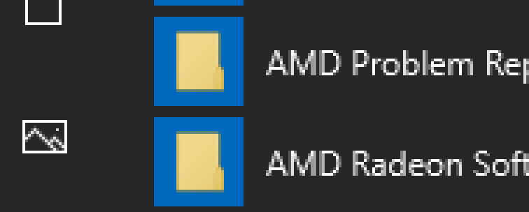
The most notable usage of this new engine is in the Start menu itself, and this leads to this “fantastic look”:

See how the “picture” icon on the right has its borders sharp and clear, while all the letters on the right are blurry? Well, it’s the same issue as before, there is no consistency in the process, the two capital R are not drawn the same.
Because that menu could not even be changed to black text on white background (see previous part for the issue with that), I was really pleased when the “light mode” was announced to be available with build 1903. Sure, this build gives me black text on white background for the start menu and taskbar, but it did not fix the issue in the start menu, it is still blurry. Migrating all the way to 1909 did not change this either, but how long will this font substitution work for the taskbar? How long before someone thinks clever to replace it by a UWP application just like the Start menu?
So, what are my options here?
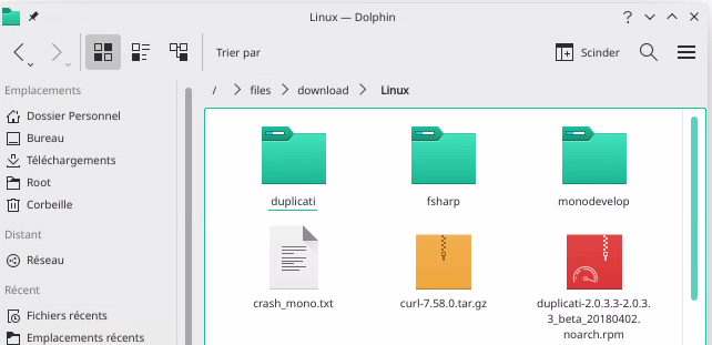
First, I could ditch Windows and migrate to Linux. As a matter of fact, I do use Linux on various computers one of which is running Manjaro with KDE. And the same issue occurs here:

While writing this article, I took the time to search for settings related to this and I stumbled across the very nice “System fonts” setting where I could choose to only activate for large fonts. Exactly what I am expecting to find under Windows, for all applications, be it GDI, WPF or UWP.
But as my main work tools are Windows only, and so are my clients, I cannot move completely. And I also have to consider the habits of the other people living in the household, who grew accustomed to Windows and would not want to migrate to something else.
The second option is to find a program that tweaks Windows with some undocumented features to achieve what I want. I have tried both WinAreoTweaker and AdvancedSystemFontChanger but they only seem to impact GDI based applications, pretty much like what the registry tweak I mentioned earlier is doing. For WPF, one can change the parameters described here: https://docs.microsoft.com/en-us/dotnet/framework/wpf/advanced/cleartype-registry-settings
With ClearTypeLevel and PixelStructure both set to 0, I was able to reduce the blurriness to a more acceptable level, similar to what can be seen in the Start menu. But it’s still there.
The third option is to completely replace the font rendering engine with the one from Linux, thanks to the MacType project: https://www.mactype.net/
It looks very promising but I could not find a way to configure it so that it behaves the same as with the options I setup in my KDE system. I’m not fluent in Japanese which the help websites seem to be most often available in. And it still is a third-party software that hacks into the heart of the operating system.
The last option would be for Microsoft to finally acknowledge this issue with font rendering at small sizes on LCD panels. Heading to the ClearType page at Wikipedia, we can read that “Hinting expert Beat Stamm, who worked on ClearType at Microsoft, agrees that ClearType may look blurry at 96 dpi, which was a typical resolution for LCDs in 2008, but adds that higher resolution displays improve on this aspect”.
My monitor is from 2006 and at 1680x1050 for a 20 inches diagonal, this gives 99 DPI which is on par with the above quote. But if I was to replace it with a brand new 24 inches with FullHD (1920x1080) resolution monitor which is the “standard” nowadays, this would drop to 92 DPI!
Sure, there are 2K,4K and even 8K monitors but they definitely are not in a price range that any regular user can afford. And this would be yet again an example of throwing hardware at a software problem, something that my entire industry seems to have been doing since its inception.
Further, even if I wanted to spend that kind of money on a 4K monitor, I would need to use 200% scaling inside Windows and yes, the blurriness would be gone because the dots comprising the monitor would be too small for me to notice. But that would bring yet another software problem which is that most applications that I use on a daily basis are not HighDPI compliant. This means that Windows would need to upscale them, bringing back with it the blurriness that I try so hard to avoid!
In the end, there should really be an option to tell the font rendering engine to stop doing any antialiasing at small sizes, and I really do hope someone at Microsoft will offer it in a not so distant future, even activating it by default when the monitor actual DPI is lower than 150.
But I’m not holding my breath on that, why would this change now when the issue has been known for more than 10 years?
